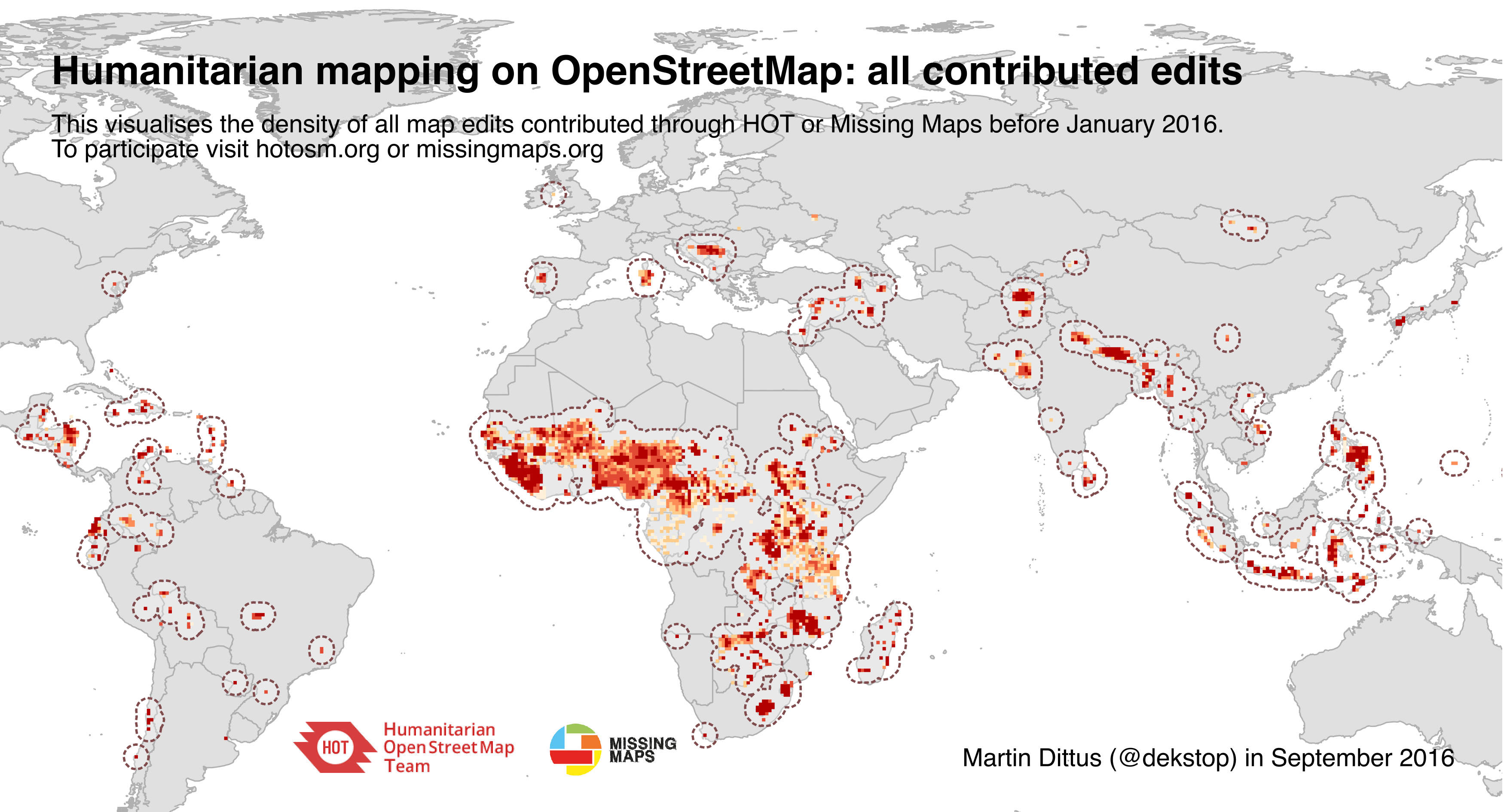
Global heatmap of HOT contributions, Sept 2016 (with high-res download)
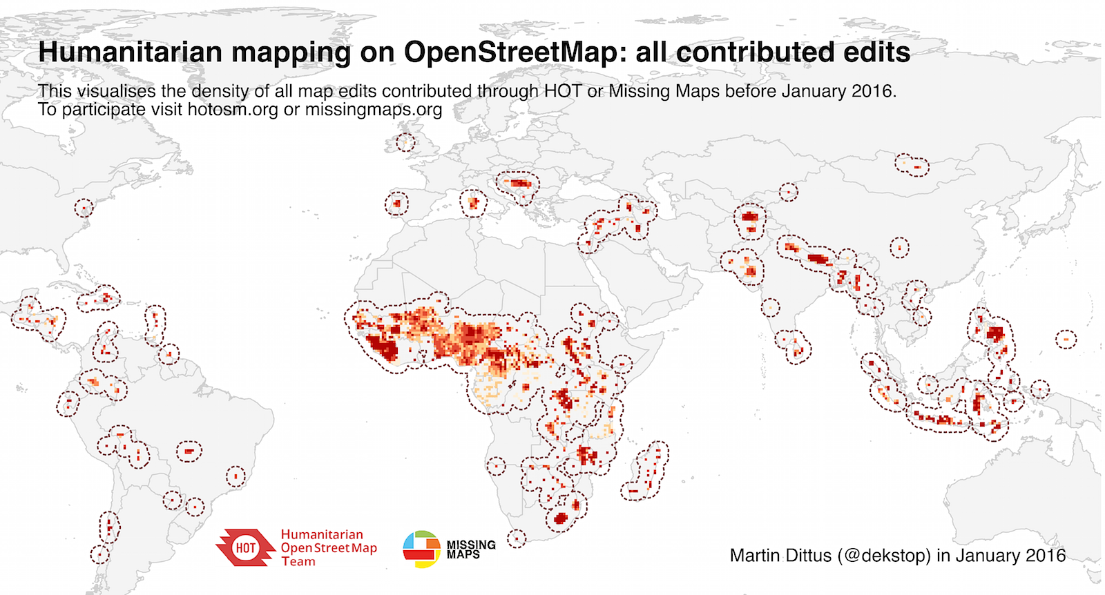
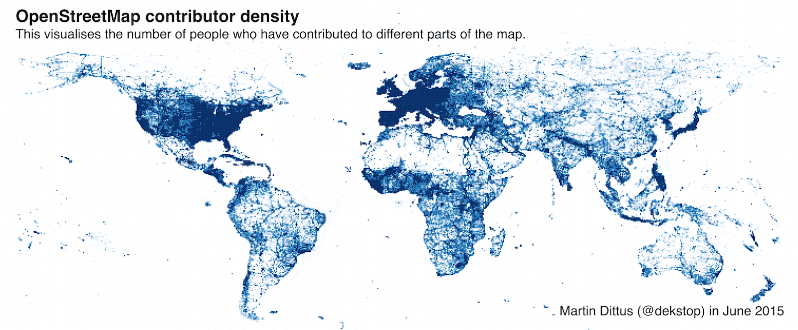
Posted by dekstop on 18 November 2016 in English.The visualisation below shows the regions of the world where the HOT community has contributed edits to OSM, which is one way in which we can show the impact of our community. The chart visualises contributions before 23rd Sept 2016. By this date, 32,000 people had contributed at least one edit, accounting for a total of 182,000,000 edits. This took an estimated 240,000 labour hours.
As mentioned before, I’ve been showing the visualisation in talks for a while now, and I regularly receive messages by people who would like to use it for their own slides, for mapathons and training sessions, and other uses.

There is also a PDF version (11MB), a high-resolution PNG (1.3MB), and a folder with older versions if you want to do a visual comparison of map growth. Send me an email if you would prefer a version without annotations – I simply ask that you provide credit when you’re using it.


