OpenStreetMap logo OpenStreetMap

dekstop's Diary

Recent diary entries

So I completed a PhD on community engagement in HOT and Missing Maps...

Posted by dekstop on 15 September 2019 in English. Last updated on 20 September 2019.

… two years ago, and I haven’t even managed to write a diary entry about it. Has it really been that long? I’ve been meaning to post a summary for the longest time, but somehow life got in the way. Fortunately, this week David Garcia and me will host a workshop at the HOT Summit and present a talk at State of the Map in Heidelberg. I’m super excited about both sessions – you should join us if you’re coming! And it became the perfect excuse to dust off my draft for this post, and make sure all the research outcomes are finally assembled in one place.

But let me start in the beginning.

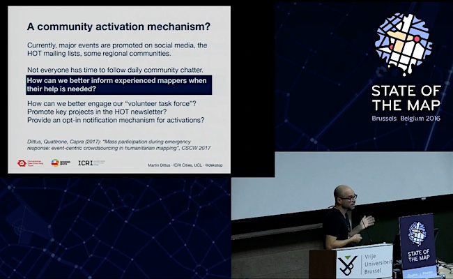
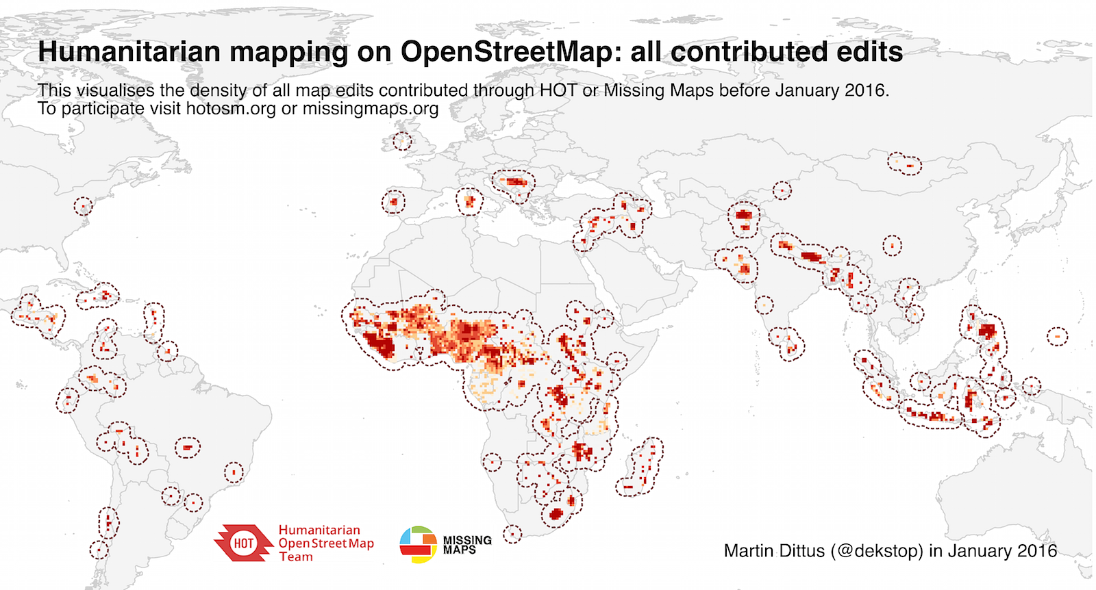
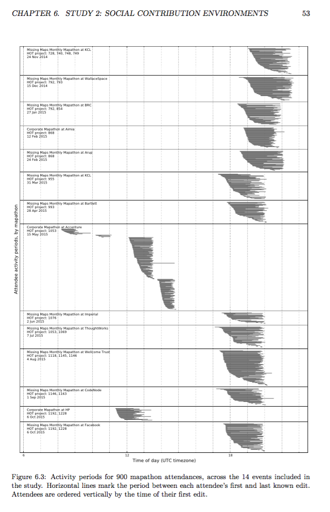
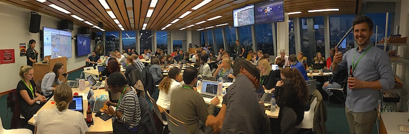
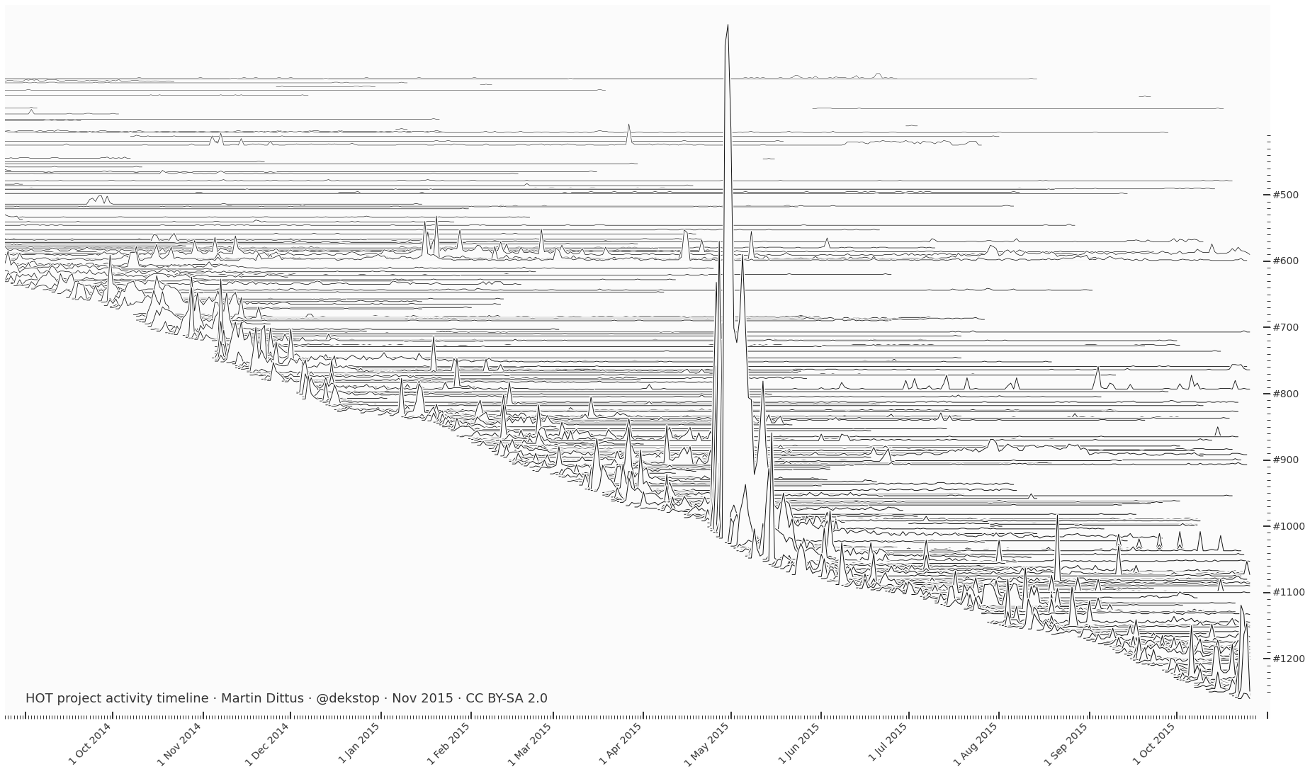
Hallo, my name is Martin Dittus, and between 2014 and 2017 I’ve accompanied HOT and Missing Maps for my PhD on community engagement in humanitarian mapping. We’ve had an amazing time together! During the PhD, we were trying to understand how best to build HOT volunteer capacity online and offline. How can we best train our volunteers so that they are available when needed? What kinds of support can we give them to ensure they don’t drop out early? And the age-old question: are the most highly engaged contributors “born or made”?

See full entry

Another round of HOT board elections is about to close, and for the first time I’m participating as a voting member. As I write this I don’t yet know the results, we will review them at the member AGM tomorrow. An exciting moment! The community discussions around this also made me aware that these election cycles are always an opportunity for a new generation of HOT members to become our representatives. From personal experience I know that this can be a daunting transition, so I invite all candidates to lean on your community for support: we believe in you, and we can offer you advice and support, if desired. (Chances are you’re already very knowledgeable and experienced.)

Such a moment might feel particularly daunting if you’re not used to being in such a prominent position within a large public organisation. This is likely true for most humans! Possibly with some exceptions – as a white male I practically get status thrown at me, and I mainly just needed to learn how to accept it with grace. But people’s experiences differ. Maybe you were taught modesty as an important virtue, and to not be too assertive in your interactions. Through many conversations over the years I have learned that such small differences can affect our respective self-image, regardless of our actual competencies; and they may inform how we approach the prospect of becoming a board member.

I’m writing this post in anticipation that we may see some new faces on the board, if not this round then later. I’m writing to share the things I’ve been taught to take for granted; and I think you should take them for granted too. (This is not a universal set of recommendations. Many people won’t be able to relate to this, or only in parts. That’s fine. You will know if this speaks to you.)

First of all, I believe in your achievements, and I will call you an expert without thinking twice about it.

See full entry

Validation feedback can provide important social affirmation

Posted by dekstop on 8 February 2017 in English. Last updated on 27 March 2017.

After my talk at State of the Map in Brussels, Nick Allen asked: are newcomers to HOT more likely to be retained if we give them positive validation feedback? And conversely, do we discourage them if we invalidate their work? I had no answer at the time, in part because many validation interactions are not public. However, I agreed with his observation that these are likely important early encounters, and that we should make an effort to understand them better. In particular, we should be able to provide basic guidance to validators, based on empirical observations of past outcomes. What are the elements of impactful feedback?

I spoke to Tyler Radford about these concerns that same day, and within a few days we signed an agreement which gives me permission to look at the data, provided I do not share any personal information. The full write-up of the resulting research is now going through peer review, and I will share it when that’s done. In the meantime, I thought I should publish some preliminary findings.

Manually labelling 1,300 messages…

I spent the next months diving into the data, reviewing 1,300 validation messages that have been sent to first-time mappers. I labelled the content of each message using models from motivational psychology, and feedback in education settings. For now I’ll skip a detailed discussion of the details, but feel free to ask questions in the comments.

I assessed the impact of different kinds of newcomer feedback:

  • Positive performance feedback: messages including comments like “good job”, “great work”, “looks good”, …
  • Negative performance feedback: “doesn’t look complete”, “missing tags”, “needs improvement”, …
  • Corrective feedback: guidance about specific improvements to improve future work, including links to documentation.
  • Verbal rewards: messages containing positive performance feedback, gratitude (“thanks!”), or encouragement (“keep mapping”).

See full entry

HOT Voting Member 2017 Personal Statement

Posted by dekstop on 1 February 2017 in English.

Thank you Ben Abelshausen for nominating me as a HOT voting member, and to Jorieke Vyncke and Harry Wood for additional support!

How did you become involved in HOT?

I have been aware of humanitarian mapping activities on OSM early on, but first really got to know HOT as an organisation through Kate Chapman’s recorded talks. In 2013 I attended State of the Map in Birmingham where I met Ben and Jorieke, and learned about the growing range of development and aid activities that had grown out of the wider OSM network. In Summer 2014, a group of people started the first regular HOT mapathons in London (they would later co-found Missing Maps). I became an early participant, and my involvement grew from there.

Could you tell us about your involvement in HOT, mapping and/or humanitarian response?

I initially became active in HOT as a PhD student researching community organisations, and after some months of exploration decided to make HOT the centre of my work. Over the last 2-3 years I’ve gradually expanded my involvement. At some point during this time I also joined a growing volunteer team around Ivan Gayton, Pete Masters and Andrew Braye to help run their mapathons and other HOT-related activities.

My first tangible contribution is maybe the talk I gave at the first HOT Summit in 2015 (slides). I showed empirical evidence of some HOT community activities and outcomes, and discussed the implications. The talk resonated well, and sparked great debate during the session. Based on the feedback I got I think this helped people gain a different understanding of their work, and their priorities. (Unfortunately the video was never published, maybe we can get it online sometime.)

See full entry

I just saw that the video for my SotM16 talk has already been online for a month… many thanks to the organisers and video team in Brussels for making this happen so quickly, and in such a high quality! You can find some summary notes further below, along with recommendations to HOT organisers.

The recording: Youtube: Building large-scale crowdsourcing communities with the Humanitarian OpenStreetMap Team

See full entry

The visualisation below shows the regions of the world where the HOT community has contributed edits to OSM, which is one way in which we can show the impact of our community. The chart visualises contributions before 23rd Sept 2016. By this date, 32,000 people had contributed at least one edit, accounting for a total of 182,000,000 edits. This took an estimated 240,000 labour hours.

As mentioned before, I’ve been showing the visualisation in talks for a while now, and I regularly receive messages by people who would like to use it for their own slides, for mapathons and training sessions, and other uses.

A global map of HOT contributions

There is also a PDF version (11MB), a high-resolution PNG (1.3MB), and a folder with older versions if you want to do a visual comparison of map growth. Send me an email if you would prefer a version without annotations – I simply ask that you provide credit when you’re using it.

See full entry

OSM Analytics launched!

Posted by dekstop on 7 May 2016 in English.

A few months ago I posted a draft specification for an OSM quality assurance tool. The first beta for the project was launched last week, it is now called OSM Analytics. Cristiano Giovando posted an announcement on the HOT blog.

OSM Analytics

The code for frontend and backend is on Github; it’s a very nice Javascript codebase, making use of many existing OSM frameworks and infrastructure pieces. We welcome your bug reports and pull requests!

I also gave a brief introduction to the tool and its uses at the most recent Missing Maps mapathon in London, there’s a recording by the BRC maps team on YouTube. Unfortunately we had wifi problems at the venue, so it’s not a very fluid presentation, but Chris Glithero took care to edit out the gaps so it’s still a decent flow.

HOT mapping initiatives over time

Posted by dekstop on 29 April 2016 in English.

Today I took some time to update my list of HOT mapping initiatives – a bit of a messy process because there’s no official listing. These days I simply review new projects in the OSM edit history that have a minimum number of contributors, and label them with a simple term. The intention is to identify groups of projects that have a common theme. Typically these are disaster events, larger mapping campaigns like Missing Maps, or organisations that organise projects for their members. Of course the boundaries between them are blurry, e.g. Missing Maps is really a meta-initiative across many discrete projects.

Here’s a timeline of the initiatives I’ve identified so far – let me know if I missed any! There’s also a PDF version, in case you want to include this in presentation slides.

#HOTOSM mapping initiatives over time

OII Talk: Big Data and Putting the World's Vulnerable People on the Map

Posted by dekstop on 22 February 2016 in English. Last updated on 9 May 2016.

Andrew Braye, Jo Wilkin and I spoke at the Oxford Internet Institute earlier this month as part of their ICT4D seminar series. Andrew gave a high-level overview of HOT and Missing Maps, Jo spoke about data collection in the field, and I spoke about my HOT community research. We had a great time! The video is now on YouTube and is about 1h long.

Our slides are all online: Andrew’s intro to Missing Maps (Google docs), Jo’s field mapping discussion (Google docs), and my community engagement analyses (PDF).

Andrew Braye, Jo Wilkin and Martin Dittus speaking at the Oxford Internet Institute.

See full entry

A global map of all HOT contributions

Posted by dekstop on 26 January 2016 in English.

I’ve tweeted versions of this in the past (Feb 2015, May 2015), and used it in talks. Here’s an updated version with data up to 13th January 2016.

In total this covers around 120 million changes to the map, by almost 20,000 contributors across 1,000 projects. This required an estimated 165,000 hours of volunteer work! There’s a monthly breakdown of this activity in this Google spreadsheet: “2016-01 HOT activity timeline”.

Global map of all HOT contributions

I’m keen to do an animated version at some point! Also, could a cartography geek please recommend a suitable projection for this map? Atm it’s just the default WGS84, with apologies :)

How to increase the number of regular HOT mappers in 2016?

Posted by dekstop on 4 January 2016 in English. Last updated on 5 January 2016.

Blake sent an email to the HOT Community WG asking for ideas on how to increase the number of regular HOT mappers. This is squarely in my research domain, so it was a fun question to respond to… I suggested things that now to me are pretty obvious, but weren’t just a year ago.

My suggestions follow, in no particular order.


Identify existing communities with a propensity for this kind of work: GIS experts, aid org volunteers, and others who are similarly embedded in existing contributor communities.

Partner with more large corporates, but choose the right ones: where there are already some HOT mappers on staff, and people who can coordinate company mapathons. Don’t go through exec, instead identify existing mappers who care. (Cf Arup, others)

Set up regular online events where people can come together in a more social fashion. Online chats, twitch streams, etc; play with the format.

More regular mapathons around the world, organised by new groups; learn from Missing Maps in London, they’re now world experts in how to do it well.

Better communication of ongoing needs: e.g. a weekly (or monthly) email which provides background info on current projects, incl mapping tips about specific pitfalls.

A well-managed validator process, similar to Missing Maps in London: try to ensure that new contributors receive good and constructive feedback early.

Better guidance on the TM homepage: instead of “pick from infinite list of words”, try to emphasise different aspects that may resonate with particular types of mappers. The easy ones: degree of urgency, type of purpose, participating organisations, “almost done” projects, projects in specific countries, … I’m sure there are loads more aspects. (Then measure which of these things people actually respond to.)

Find means of identifying people who are actually interested (or likely to be interested), and then give them more specific support. For example, make sure they’re connected to a mentor or a peer group.

See full entry

Should we teach JOSM to first-time mapathon attendees?

Posted by dekstop on 7 December 2015 in English. Last updated on 8 December 2015.

Joost asks in a direct message:

I’m organizing a Missing Maps event in Antwerp. One of the co-organizers wants to try giving a tweaked JOSM version on a USB stick to all the participants (preloaded settings etc) and use JOSM as a default editor. […] Did anyone try this at an event? Did you have a look at first timers using JOSM having a higher or lower OSM/MM retention? (It might be too much self-selection to really prove anything…)

I thought this was an interesting angle, and it connects with some of the work I’m currently doing, so I had a look at the data and am posting the results here. The short answer, based on a small sample: we’ve actually seen a difference in retention! However not in the way you might expect. I was surprised.

Before I begin I should say that I’m very interested in other perspectives on this question, particularly actual teaching experiences. This is a good scenario where statistics might be misleading, and where it helps to have actually talked to the mappers and observed what happened. Looking forward to people’s comments!

Preliminary caveats

It’s actually really hard to measure this well and generalise from past experiences, because every mapathon has its own story; different people attending, different things going right or wrong, etc. Different editors are also often used for different kinds of work: JOSM often gets used for field paper tracing and validation as well as satellite tracing. Unfortunately I haven’t been to most of the JOSM training sessions I’ll quantify below, so I don’t know what people actually did!

Furthermore, editor choice affects all kinds of follow-up considerations that may affect the outcomes of such a study; e.g. I’ve seen people forget how to launch JOSM a month after they first installed it, or OS updates causing java versioning issues, all of which is not something that can happen with iD.

And so on. You get the idea: many factors to keep in mind when we look at these numbers.

See full entry

Secondary benefits: the social experiences of HOT contributors

Posted by dekstop on 2 December 2015 in English. Last updated on 11 December 2015.

I had a recent shift in perspective in my research of HOT contributor engagement. I will try to articulate a growing intuition: a sense that current-generation HOT tools and processes would do well to also recognise the secondary benefits HOT volunteers get from their participation, for example their social experiences. I think we currently don’t necessarily create social online spaces for new contributors, and that is an omission of some consequence. In contrast to Wikipedia and comparable platforms, HOT contributors are not also typically the primary beneficiaries of the collective output. Secondary benefits can make up for this lack in direct utility: they have important motivational power.

As usual, please let me know your thoughts on this. It’s informed by my own experiences of the HOT and Missing Maps community, and I am very curious to learn what I might have overlooked, how else to express it, or find other ways to look at things.

Thumbs up for mapathons!

See full entry

Distribution of locales (languages) among HOT tasking manager contributors

Posted by dekstop on 9 November 2015 in English. Last updated on 5 January 2016.

Inspired by recent Transifex discussions I though it’d be interesting to see what languages our contributors actually speak — to the extent that we can easily find out. It turns out that as of May 2015, iD now submits a “locale” changeset tag — JOSM has been sending that information for a while already.

The top entries across both editors are shown below, for May-October 2015 (inclusive). Note that a locale with a small number of contributors is not a locale that matters less – as we’ve established before, a small number of contributors can make a significant impact on the maps of a region.

There’s also a Google spreadsheet with separate tabs for iD and JOSM contributors, if you want to dive further into the data: “HOT contributor locales, May-Oct 2015”. Or as CSV files: combined, iD, JOSM. It’s interesting to compare their distributions. E.g. iD has a much longer tail, which I guess is not a surprise – browser locale vs limited JOSM translations?

UPDATE: Ilya Zverev has kindly amended the spreadsheet to also show translation progress for each locale!

See full entry

Unknown Pleasures (of humanitarian mapping)

Posted by dekstop on 5 November 2015 in English. Last updated on 6 November 2015.

Unknown pleasures (of humanitarian mapping)

Harold D. Craft’s classic visualisation technique applied to a timeline of HOT project activity. As previewed before and used in the Missing Maps review, but updated for early November 2015. Click through for the full version.

A line per tasking manager project, its height along the implied z-axis is proportional to the number of project contributors on the respective date. Projects tend to be most active in the beginning, and then activity tails off. However some large projects are eternally active… MapLesotho (#597/599) is among these, partially covering the equally long-running South Sudan (#591). Remarkable how massive the Nepal contributor community actually was, in the scheme of things – the big spike in the centre would be even taller if the work hadn’t been spread across multiple projects (between #994 and #1090).

There’s also a PDF version if you want to print it out.

See full entry

Quantifying HOT participation inequality: it's complicated.

Posted by dekstop on 26 October 2015 in English. Last updated on 27 October 2015.

Pete asks:

On a skype today, Kate Chapman said that analysis after the earthquake in Haiti, she found that ‘40 people did 90% of the work’ within the community.

Is the workload more evenly spread throughout the community when it comes to Missing Maps tasks as opposed to HOT tasks? Is it more evenly spread during non-emergencies?

I thought I can look at this quickly because I’d done similar work around participation inequality in the context of OSM; in the end took much longer than expected and I can’t see that I found a simple answer. If anything it serves as a good reminder why it’s challenging to produce meaningful statistics for social spaces: the devil is in the many nuances. This writeup here can probably give you some impression of that.

Unfortunately I don’t have contributor statistics for Haiti since it predates the tasking manager, instead I will compare Missing Maps with other large HOT initiatives, most importantly Typhon Haiyan in the Philippines in 2013, but also the Ebola activation in 2014, and Nepal in 2015.

The impatient can skip the more in-depth discussion and jump to the conclusion section at the bottom. Note that this is just a quick exploration, not a thorough statistical analysis. I’m sure I’ve overlooked things, so please give feedback.

As usual I’m looking at labour hours as a measure of work. The results are probably not that different than if I’d used map edits, however I find they’re a better reflection of the effort spent on contributing. Time moves at the same pace for everyone, while the same number of clicks could yield a different number of edits depending on what you’re doing. Edit counts are also a potentially confusing measure because there’s no standard way of counting them: as the number of version increases of geometries, or the number of changesets? Etc. So here’s a key limitation of these stats: I’m not actually looking at map impact, instead I’m looking at a measure of individual effort.

See full entry

Missing Maps: the first year in stats & charts

Posted by dekstop on 22 October 2015 in English. Last updated on 23 October 2015.

Stats & charts I put together for a session at the Missing Maps powwow in Toronto (PDF)

Slides preview

I had no time to prepare for this, so on the plane from London I simply went through my work of the last few months and collected things that seemed appropriate for the occasion. I intended this as a quick 30-minute review, but it ended up stimulating lots of debate throughout… so the session took 2h instead. For a conference setting this would have been disastrous, but since this was a team gathering it was actually quite useful. Data visualisation as conversational catalyst!

See also Dale’s recap of the powwow.

See full entry

I only recently realised that HOT contributors need to mark at least one task as “done” to be listed as project contributor in the tasking manager. This made me wonder: how many people start contributing to a HOT project but never finish their first task? What proportion of all HOT edits are contributed in this manner?

Summary: about half of all HOT contributors never complete their first task on a project, although they do contribute to the map. These “partial” contributions account for 10-20% of all HOT edits.

Here’s a timeline of the number of monthly HOT contributors, compared with the number of those who completed at least one task:

HOT contributors with completed tasks

And here the corresponding timeline of the number of edits contributed by both groups of people:

See full entry